Prototype pictures
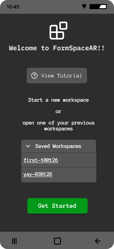
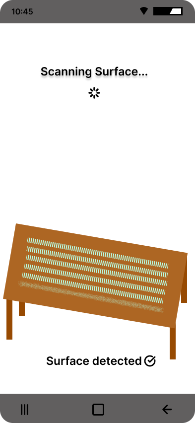
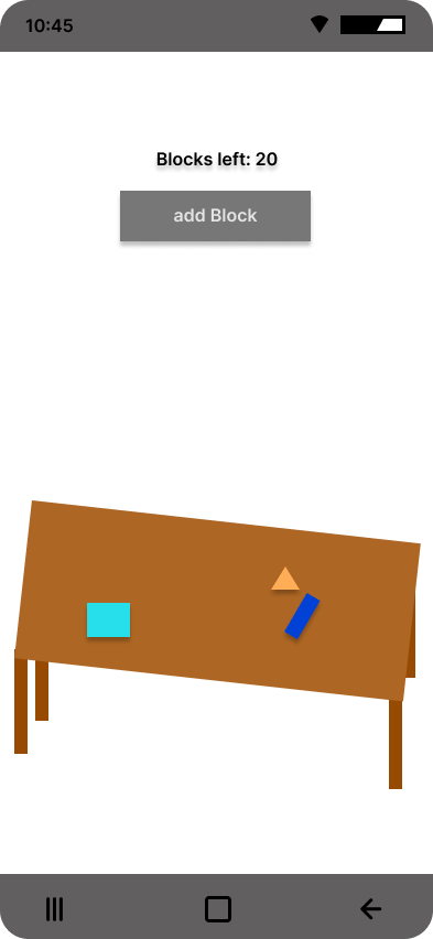
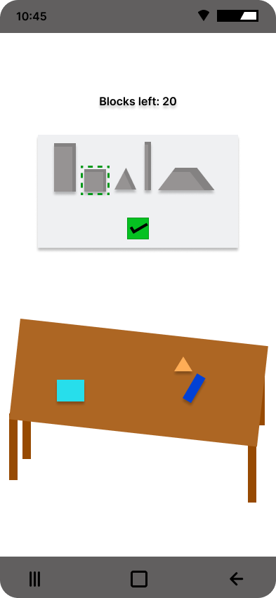
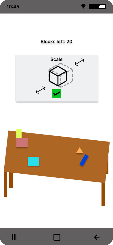
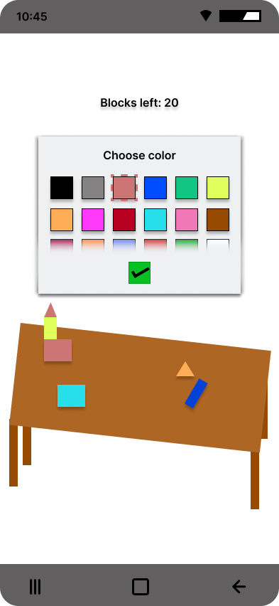

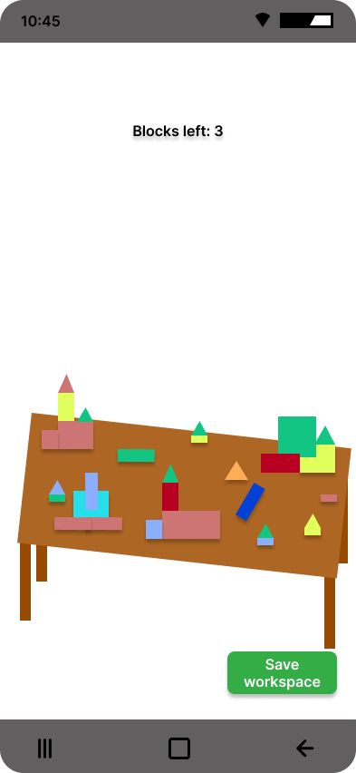
AR Build Studio is a workspace where users can prototype spatial designs by scanning a surface and using virtual blocks in augmented reality. Users can save their builds, as well as reopen and edit them.
Team members: Emil Größinger, Livia Gaind
Use case: AR Build Studio enables spatial prototyping and professional planning in AR. Users, like creative individuals and Planners, or Professionals and Designers can scan real-world surfaces like tables, floors or counters and place, move, and arrange with virtual blocks to plan and build layouts, design spaces, and visualize concepts before implementing them.
Target users: Professionals, Designers, Planners, Creative Individuals
Our primary goal of the usability testing was to evaluate the ease of use and fun of our AR Build Studio app. We also wanted to find out if any features were missing or if we needed to alter the UI. We conducted the usability test by starting with Pre-Test questions to get demographics like age, gender and how familiar they already are with AR. After that we conducted the usability test. Directly after completing each task we asked the user how easy it was from a scale from 1-7. After the test, users had to fill out a SUS-questionnaire and a few Post-Test questions . After conducting the test with 3 participants, we decided to improve our app based on the points that were often mentioned by the previous participants. Then we continued our Usability Testing with 3 more participants, now with the improved version.
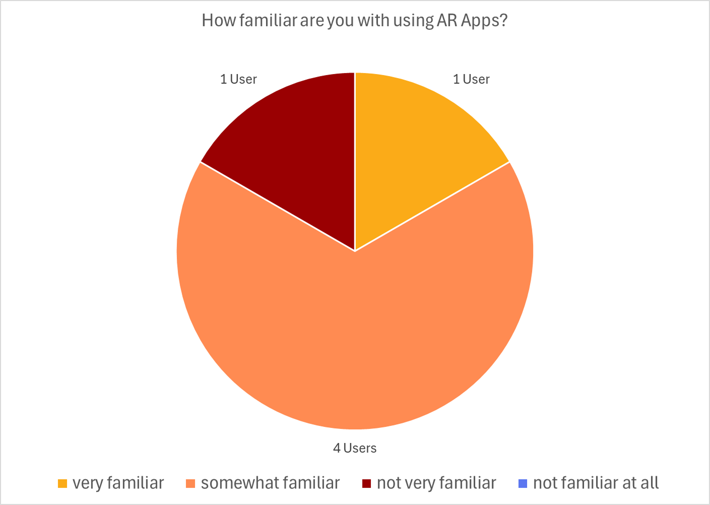
First Test: 1 male, 2 female
Second Test: 2 male, 1 female
The app is fun and easy to use without need of prior knowledge of AR Apps.
Demographics of the users and finding out if they have experience with AR apps
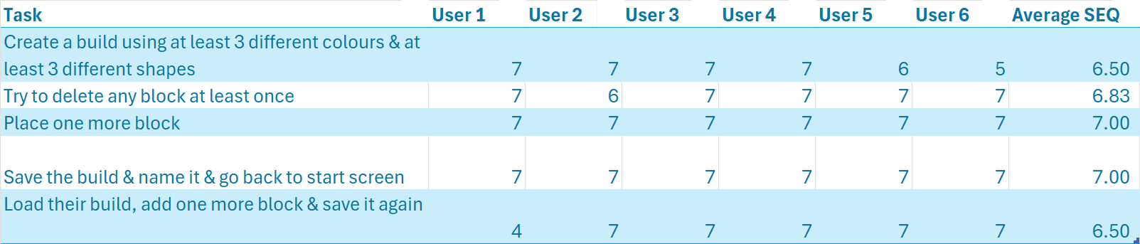
Ease of use with SEQ (Single Ease Question) after each task
SUS (System Usability Scale) after the test
Qualitative feedback during and after the test using questions in the form after the test and the think aloud comments during the test.
The participants were asked to complete a series of tasks while thinking aloud. The following 5 tasks were given:
6 participants in total, 3 female & 3 male
4 participants age 20, 1 participant age 26, 1 participant age 36
1 = hardest, 7 = easiest
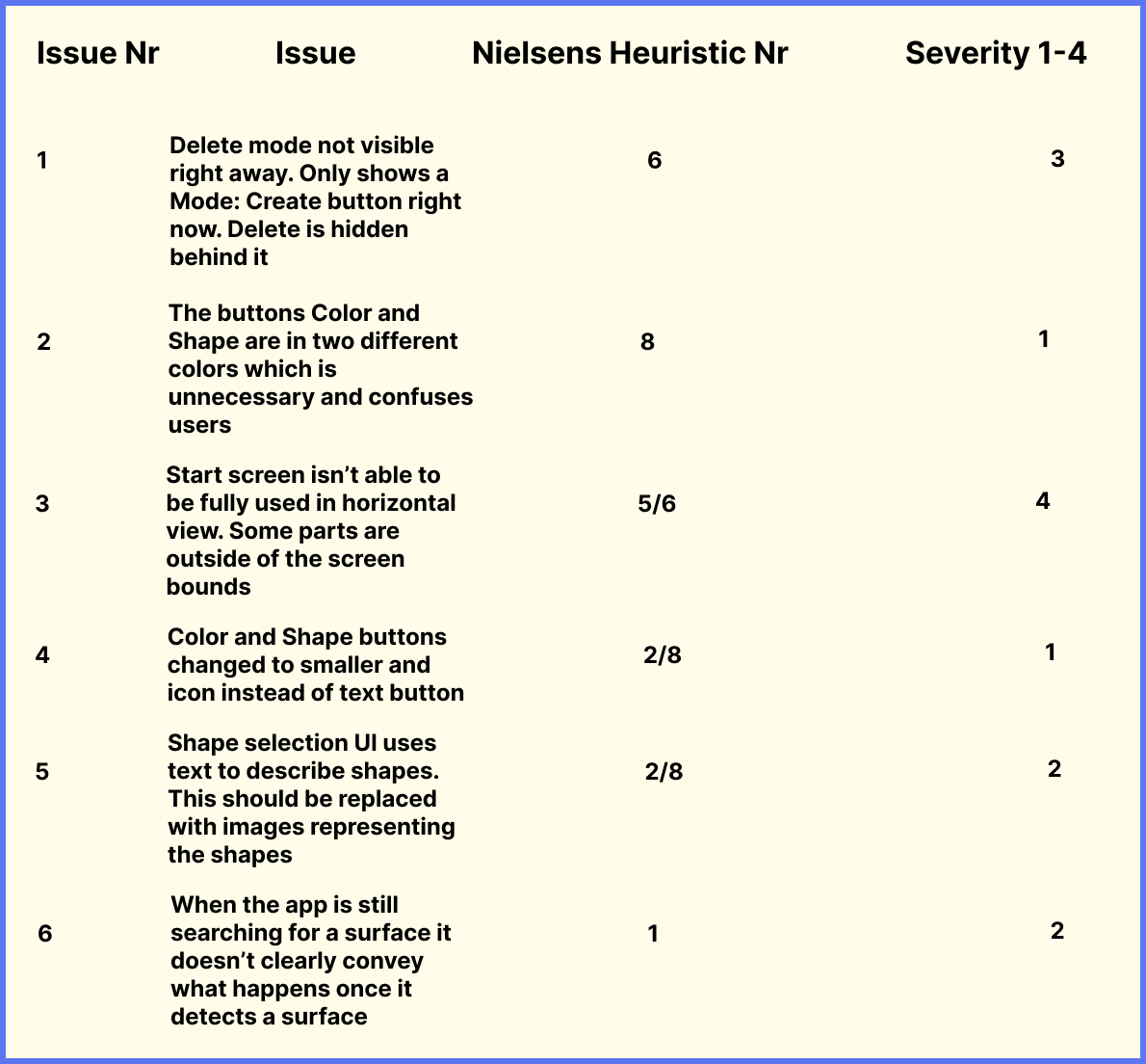
It would make more sense if deleting is an own button or I would just make a toggle button.
Deleting is a little confusing/ hard to find
Change the mode dropdown to a toggle button to switch between create and delete (mode).
Why colour button blue and shape button violet? → choose one and make them same color
Add Brush icon for colour button, cube for shape button
Primary Buttons (mode, color, shape) hard to reach, should change so be reachable , but not back button and save button.
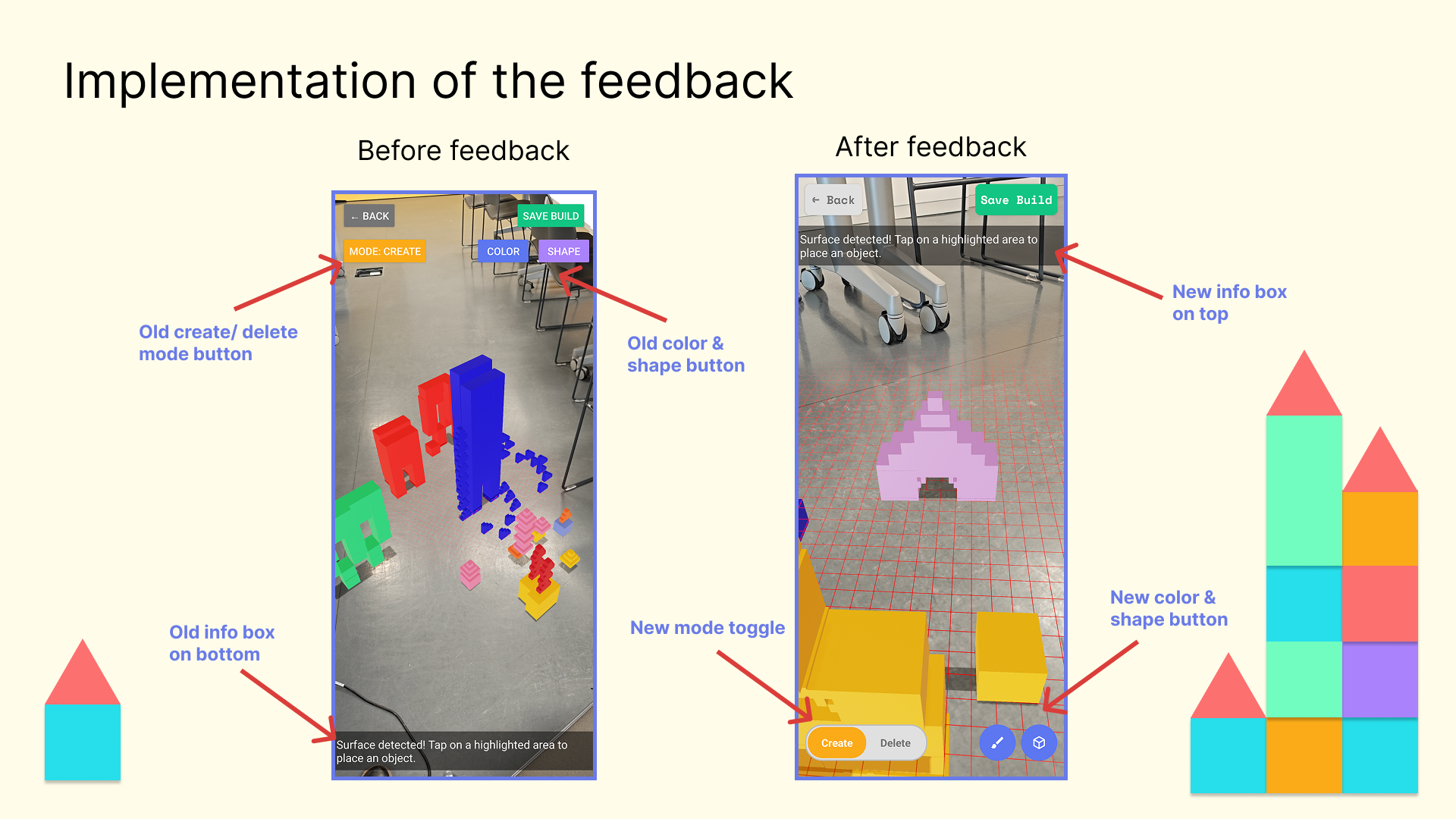
Example of how we implemented the feedback & results of our usability test
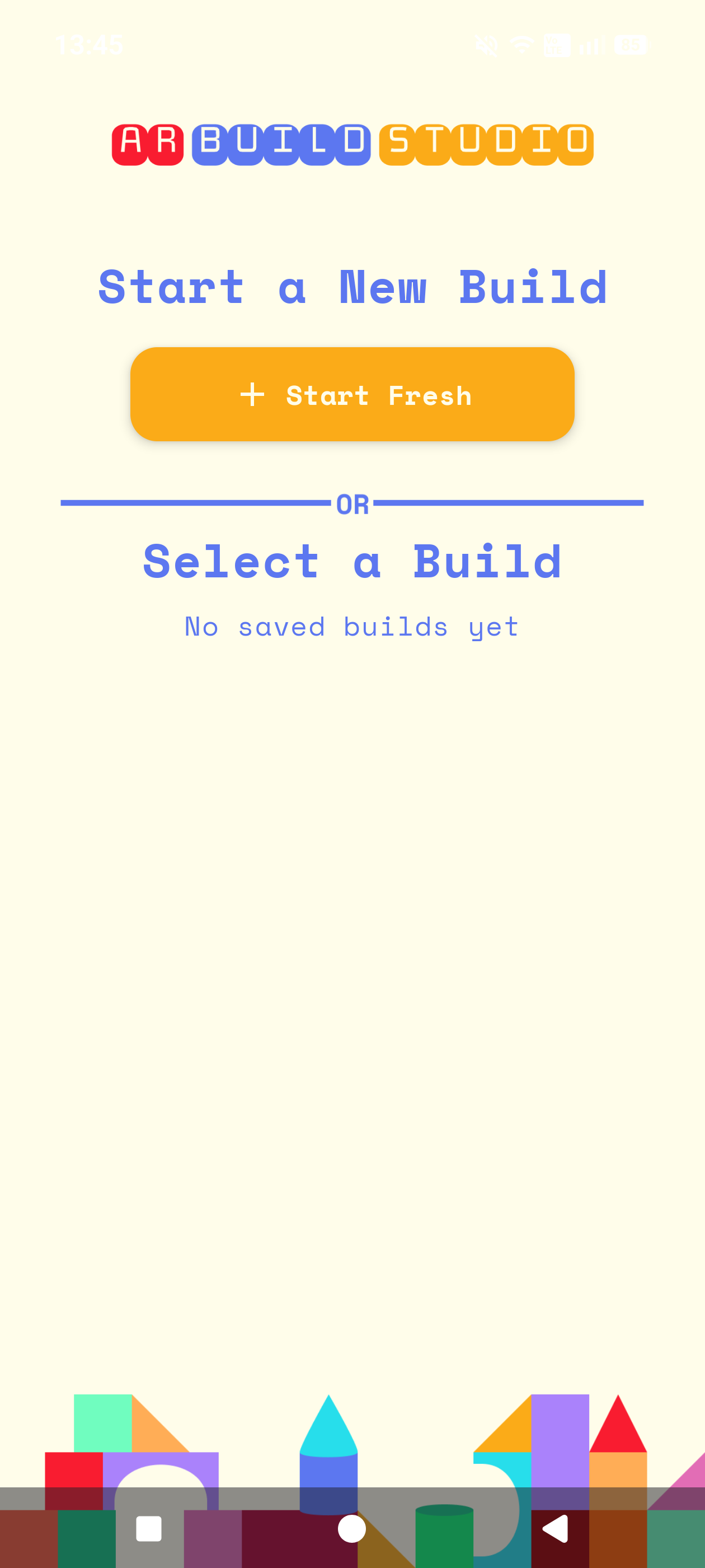
Start screen
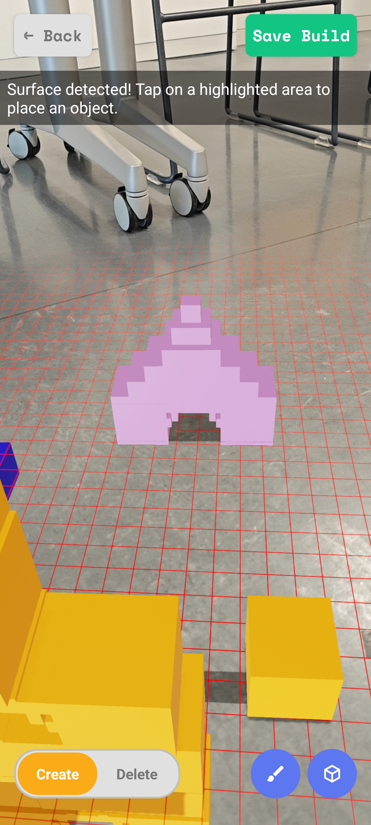
AR Activity
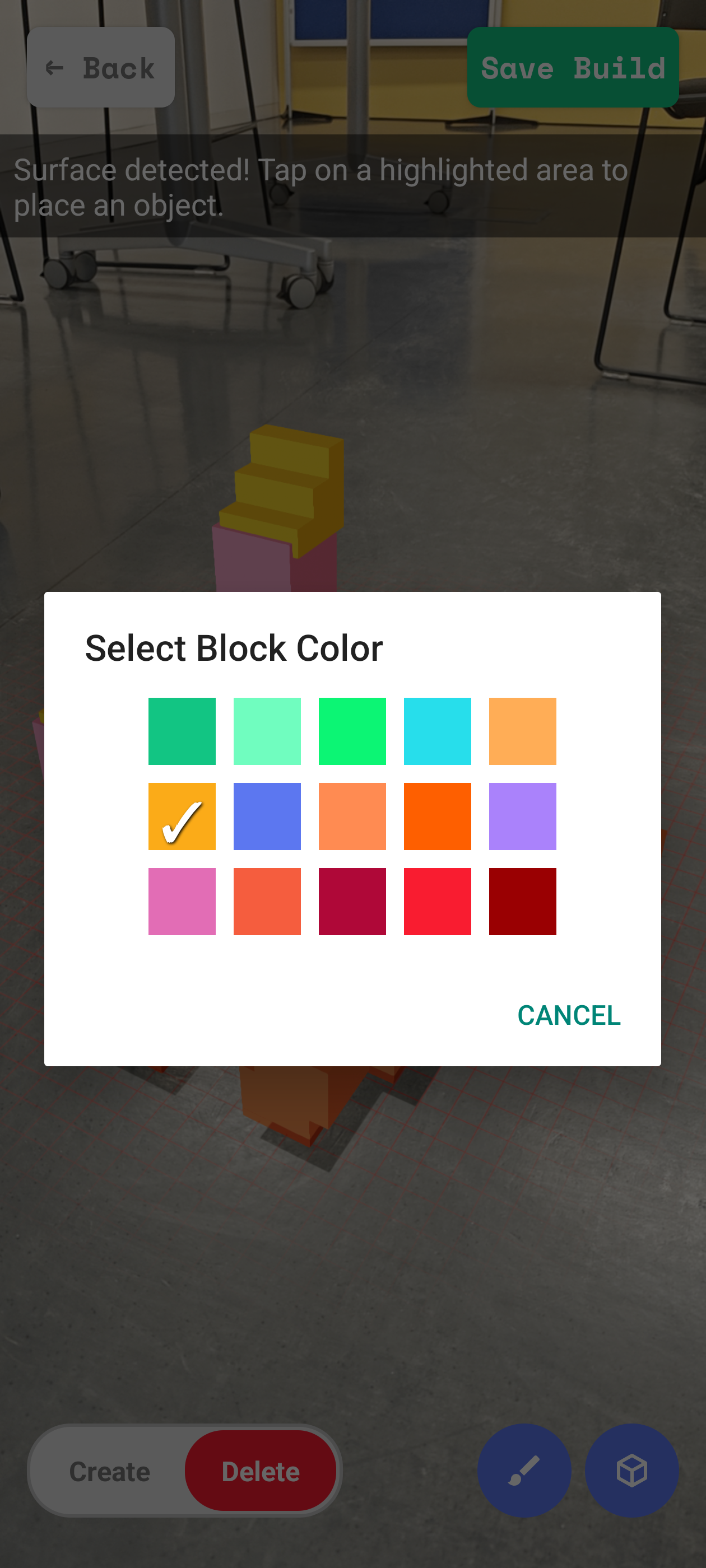
Color selection
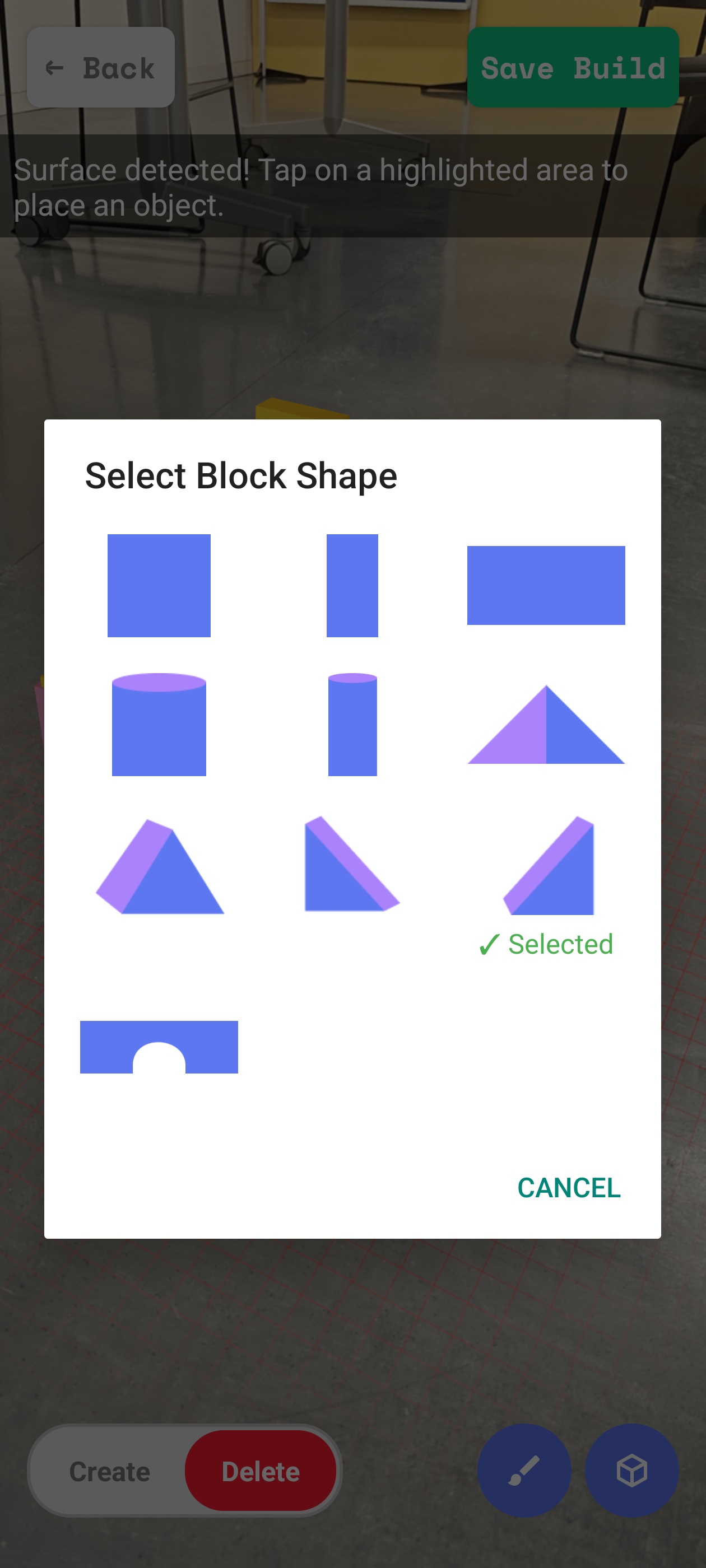
Shape selection
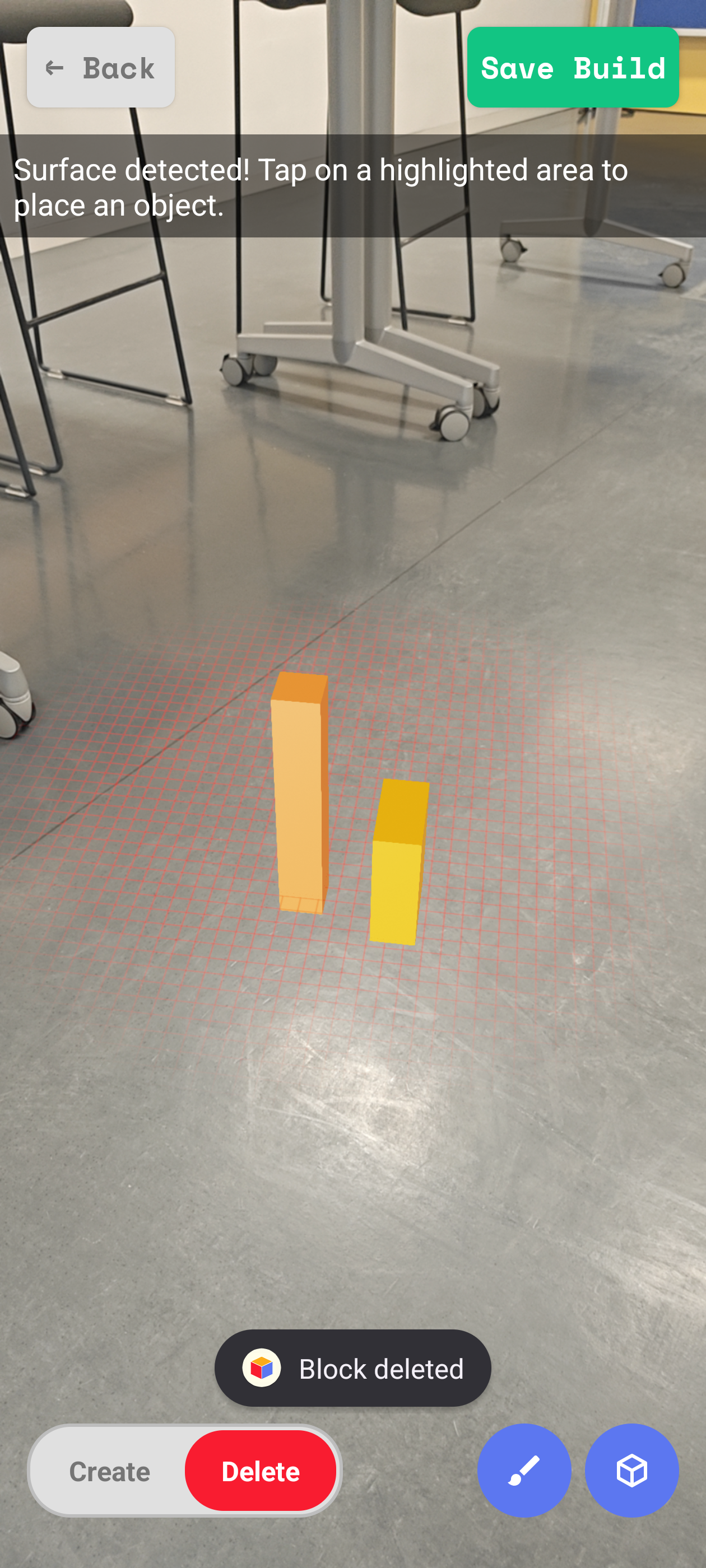
Deleting a block
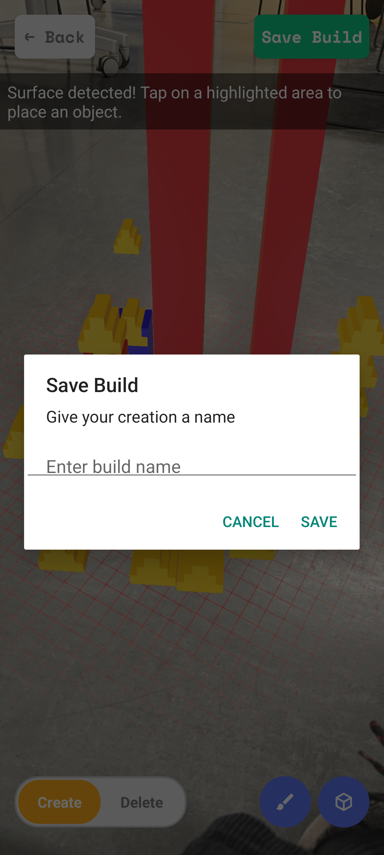
Save & name build
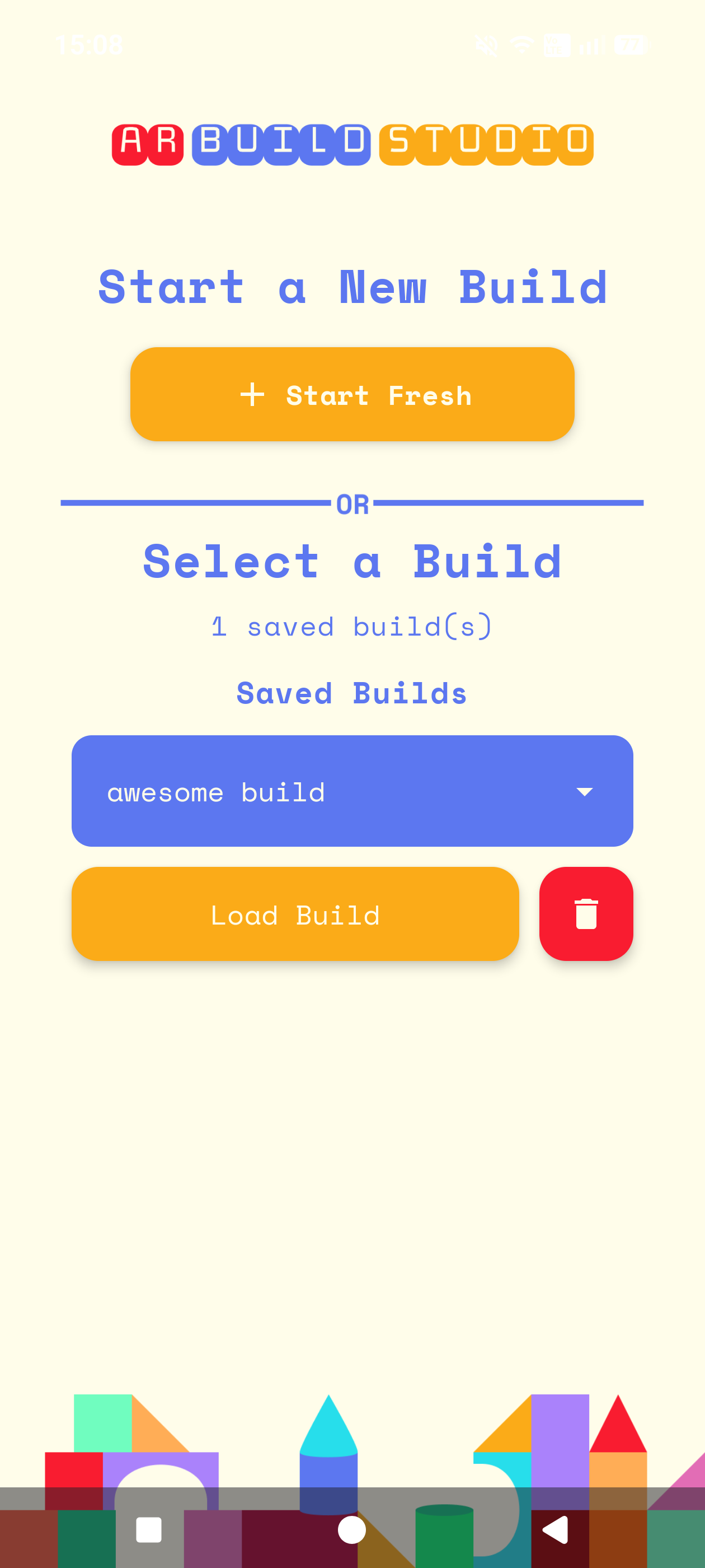
Start Screen with a saved build
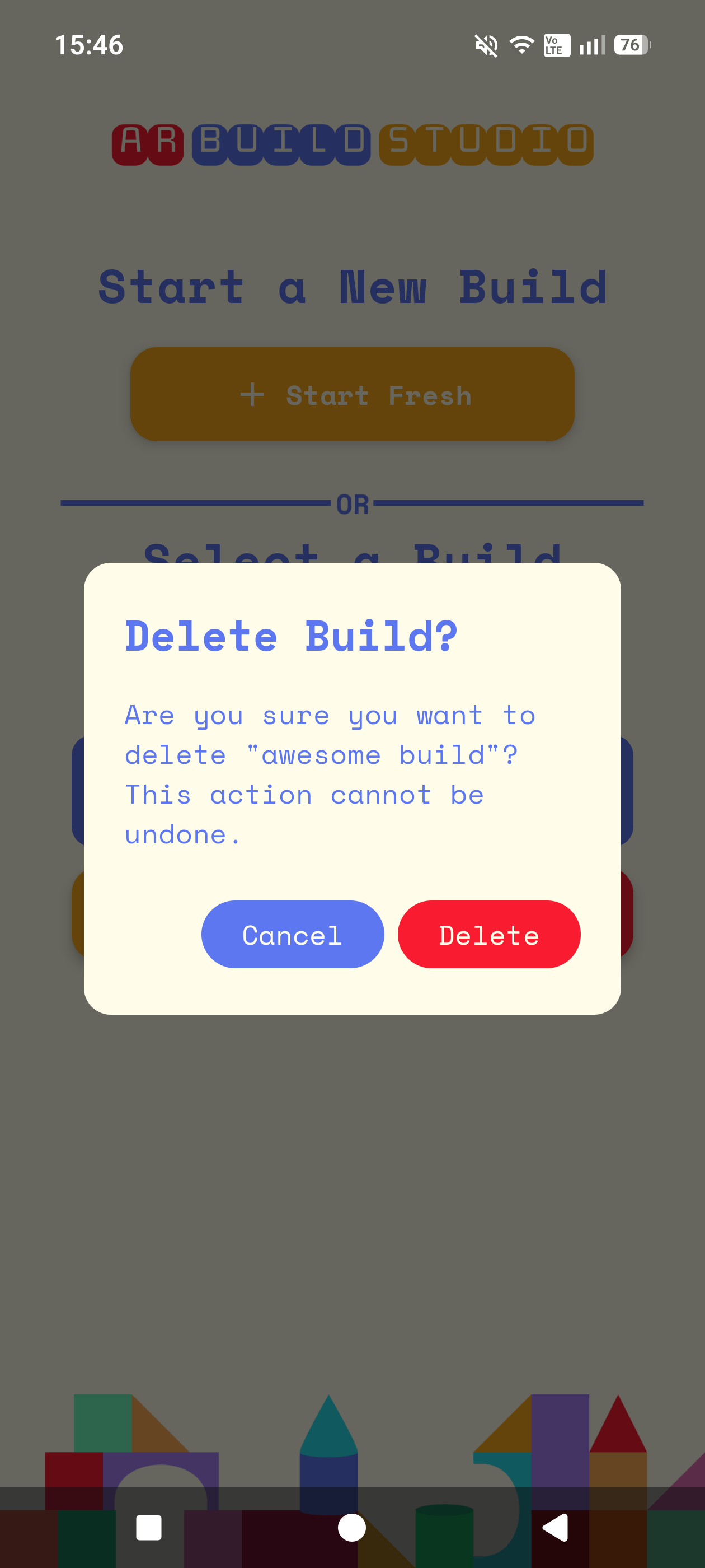
Deleting an entire build
UI, Code, Design, Pages/Documentation, User Test Plan, User Testing, Logo, Database Setup, Presentations
Any logic that had to do with the AR was complicated, but one of the hardest parts was figuring out how to allow multiple 1 wide blocks be able to be placed on a 2 or 3 wide block. Finally figuring it out and seeing it work felt very rewarding.
Absolutely :)
I am really happy with the UI & overall coherent design. The functionality of the AR is better than I envisioned and I am really proud of how well the saving and loading of builds work.
Rotation & Scaling of each block, Even more color & shape options, Tutorial for first time using the app, long tap vs short tap gestures having different functions
UI, Code, Design, Pages/Documentation,User Test Plan, User Testing, Presentations
One point that really challenged me was changing the logic of the code after we added a new feature and the code suddenly stopped working or did not work the way we intended it to work. But it also helped us a lot because it made us aware of errors or just inconsistency in the code that might have slowed us down or might have caused us problems later on.
Yess! I think we achieved our initial concept, I think the way the different features work and the design and whole UI we implemented fits perfectly with our app. We made good process early on in implementing all the things we wanted to have in our app within the two weeks.
I think adding a Tutorial screen that appears when you use the app for the first time but which could also be called up, to be able to view it again would be nice. Being able to rotate a block, changing the size of a block freely or choosing from several sizes would also be a great improvement. To be able set a custom icon to a build for better recognition could be added too.